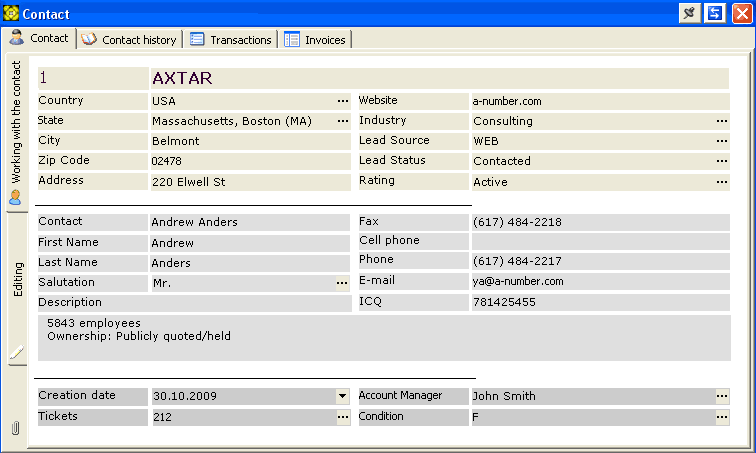
The Contact's Business Card is automatically created for every new record in the database, and is presented as a window with multiple tabs.
The Arrows  icon
"folds" the Contact's Business Card window into
its title bar.
icon
"folds" the Contact's Business Card window into
its title bar.
 icon locks the Contact's Business Card window in either the open
or folded state.
icon locks the Contact's Business Card window in either the open
or folded state.
If there are any pending reminders related to the current contact, a Paperclip icon  appears in the bottom left corner of the Contact's Business Card window. Clicking on this icon opens the list of those reminders in a new window.
The first tab Contact contains a set of elements, arranged by the user.
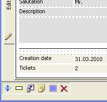
When you first start using the program, the contact's business card does not contain any elements. You will need to create the business card layout. To do that, select the vertical tab Edit on the left, this will make the card's layout editable. A grid will appear over editable area, plus a toolbar at the window bottom with buttons provided for manipulating the elements.
The  button
servers for switching into neutral mode.
button
servers for switching into neutral mode.
The button  serves
for placing textual labels on the card. To do that, click on the button,
then click somewhere on the card where you would like to place your label.
Once you have clicked, a window will open prompting to enter your label's
name. Click on button, and your newly-created
label will appear on the Contact's Business Card. If you clicking on the button, the label will not be created.
serves
for placing textual labels on the card. To do that, click on the button,
then click somewhere on the card where you would like to place your label.
Once you have clicked, a window will open prompting to enter your label's
name. Click on button, and your newly-created
label will appear on the Contact's Business Card. If you clicking on the button, the label will not be created.
The  button
serves for placing input fields, in fact, table cells, on the card whereby
the user can enter, view or edit data in tables. Fields must be created in
advance by the administrator. Up to 200 fields can be created. On the card,
the field appears as an input field where the user picks one from a list
of existing columns in the tables of the current database. The list of available
fields contains only those to which the user is granted access. User privileges
are granted by the system administrator.
button
serves for placing input fields, in fact, table cells, on the card whereby
the user can enter, view or edit data in tables. Fields must be created in
advance by the administrator. Up to 200 fields can be created. On the card,
the field appears as an input field where the user picks one from a list
of existing columns in the tables of the current database. The list of available
fields contains only those to which the user is granted access. User privileges
are granted by the system administrator.
It is possible to create fields with hyperlink content. To do that, when placing a field on the card, pick the String data type and when asked about the data type of the field you are creating, click on button.

Likewise, when creating the Date field, it is possible to choose between and .

The  button serves for placing multi-line, automatically word-wrapped texts on the
card.
button serves for placing multi-line, automatically word-wrapped texts on the
card.
The  button creates a frame-like element, which allows to group elements visually.
By using Object Inspector, you can set the panel's color, size, position, and
more.
button creates a frame-like element, which allows to group elements visually.
By using Object Inspector, you can set the panel's color, size, position, and
more.
The  button
dubs the Del key on the keyboard serving for
deleting any selected element on the card.
button
dubs the Del key on the keyboard serving for
deleting any selected element on the card.
To select several elements on the card, press and hold the Shift key on your keyboard, then click the left mouse button on the desired elements while holding the Shift key. You can then manipulate the selected multiple elements as a single group: move it around, delete, etc.
The Object Inspector
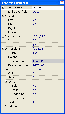
This tool window opens automatically when you select an element in the editing mode. It gives you access to all the properties of the selected element, such as typeface, text color, background color, position on the card, anchor (snapping to borders). To edit a single property of the element, press Enter key on your keyboard.
Saving the Layout Changes
Every time you exit the editing mode, your changes are saved automatically,
regardless of whether you switch into working with the database records or
exiting the program without leaving the layout editing mode.